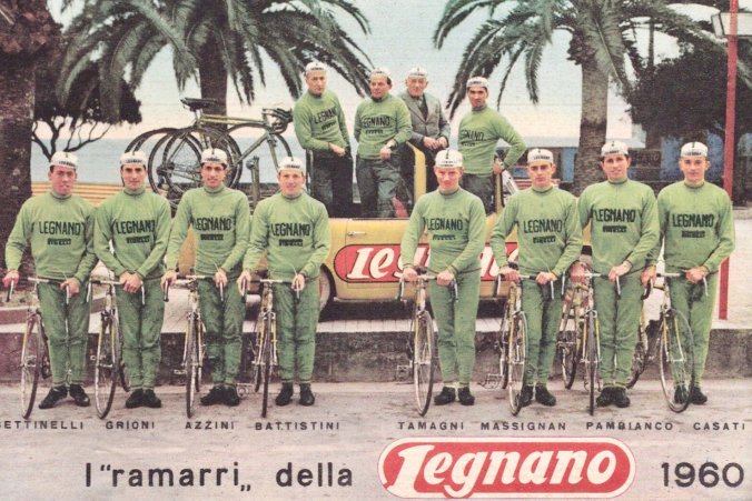
i ramarri

Have you ever looked at an old Legnano racing bicycle frame? I am not talking about the 1980s Maurizio Fondriest era machines that were very beautiful and of their day.
I am talking about what Gino Bartali would have known in the first decades after World War 2.
The Legnano brand mark of this period is a stencil, not a transfer, you can almost see the brush marks, white lettering on a maroon background. The font is informed by the physical limitations of a stencil and revels in the aesthetic and constraint of one. This stencil mark could be used on a packing crate, a car door or as a template for an embroidered jersey. Simple modern tools for mass production, mass production by hand. The font is high modernism, function and form in what looks like a simple expression. The Legnano downtube mark would not look out of place on a packet of sugar in a cafe, it somehow slides into that everyday effortless Italian design that is in the background of everyday life.
As your eye moves around a 1940s Legnano you are quickly confronted by the headtube badge. This headtube badge is imposing like a tombstone. It looks out of size and from antiquity. Something Nero would have had cast in bronze or something on a Gianni Versace underwear draw. It jars with the modernism of the font, but somehow works in that unexplainable way that Italian culture and design can. Like an ancient city, neon lights, bill posters slammed up against marble and fountains.
The headtube badge is on a white painted head tube which is topped and bottomed with chrome lugs. The lugs are large and made of pressed steel and you can see this. They are large and with minimal amount of fettling from the frame builder. They are supremely functional, large gussets for strength, to hold bronze and hold the tubes together. They are like a buttress of a building, but a buttress that has a thick coating of chrome. Looking at the shorelines where the lugs meet the tubes, you can see file marks of the frame builder, these can be seen all over the frame. Look where the chainstays meet the Campagnolo cast dropouts, or where the seat stays meet the 'back to front ' seat cluster and the maker's mark is apparent to see. Like a hand thrown pot or real Gnocchi, it is part of the beauty.
Standing back from the frame, looking at it as a whole, the maroon of the logo and the white and chrome it all comes together with the beautiful metallic green the frame is painted in. Ironically, these colours were seen as very bad taste when this bike was new.
The pro riders were called "i Ramarri"(the Frogs)...for me the makers kissed these frogs and made princes of design! - Text by Camille McMillan
